
Koffiesaeck
Brand refresh
Client: Koffiesaeck
Scope of work:
-
For this project I worked on a brand refresh: we kept the logo and basic elements, since the Koffiesaeck had only been in town for a year, and was just starting to build some brand recognition. I expanded the ‘primary’ logo that had been in use to a full logo kit, and simplified the other design elements (less colors, only 1 style of illustrations, only 2 fonts) to give the brand a more professional look.
-
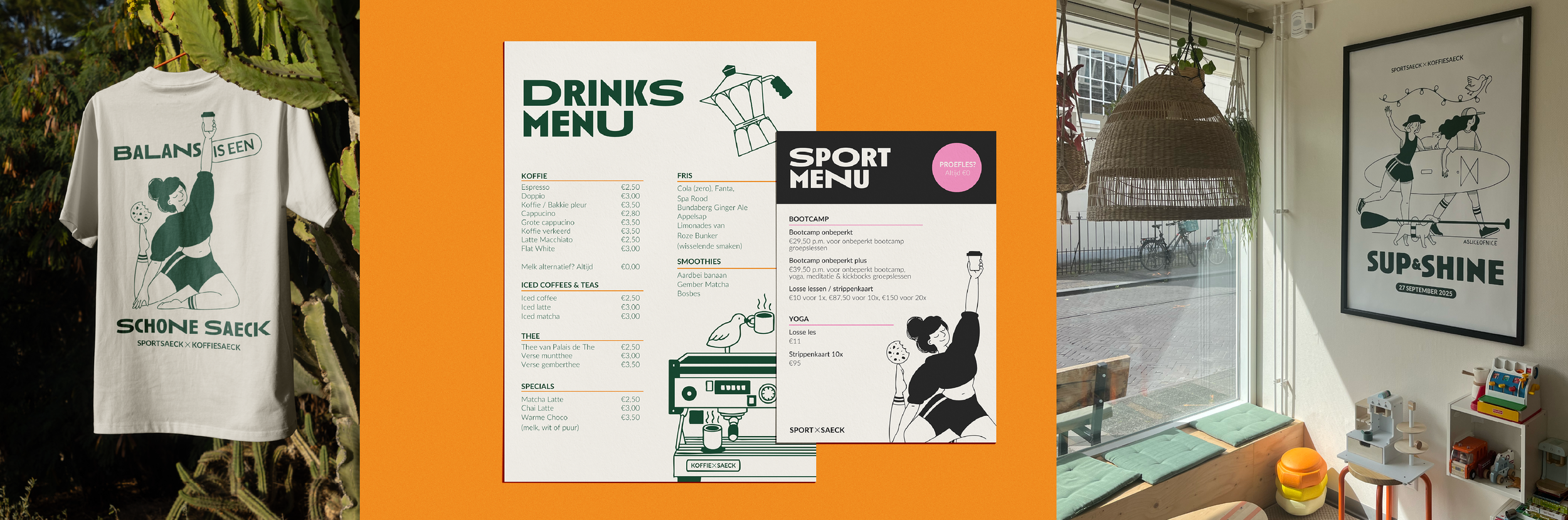
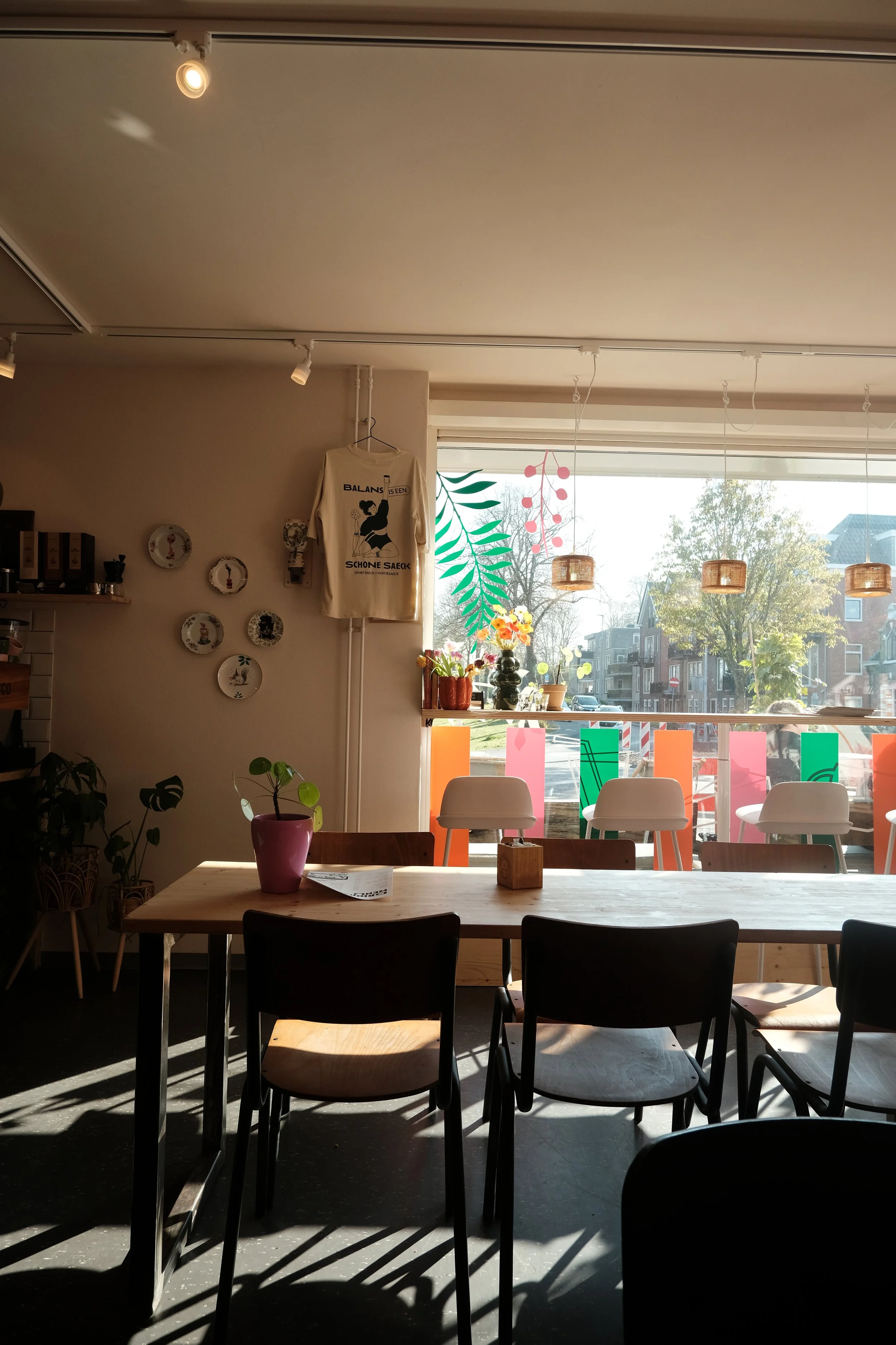
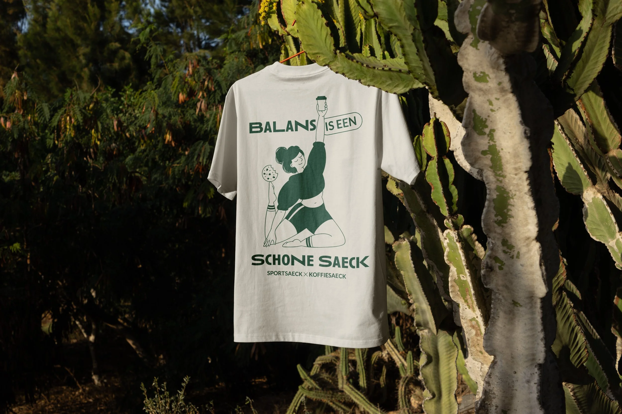
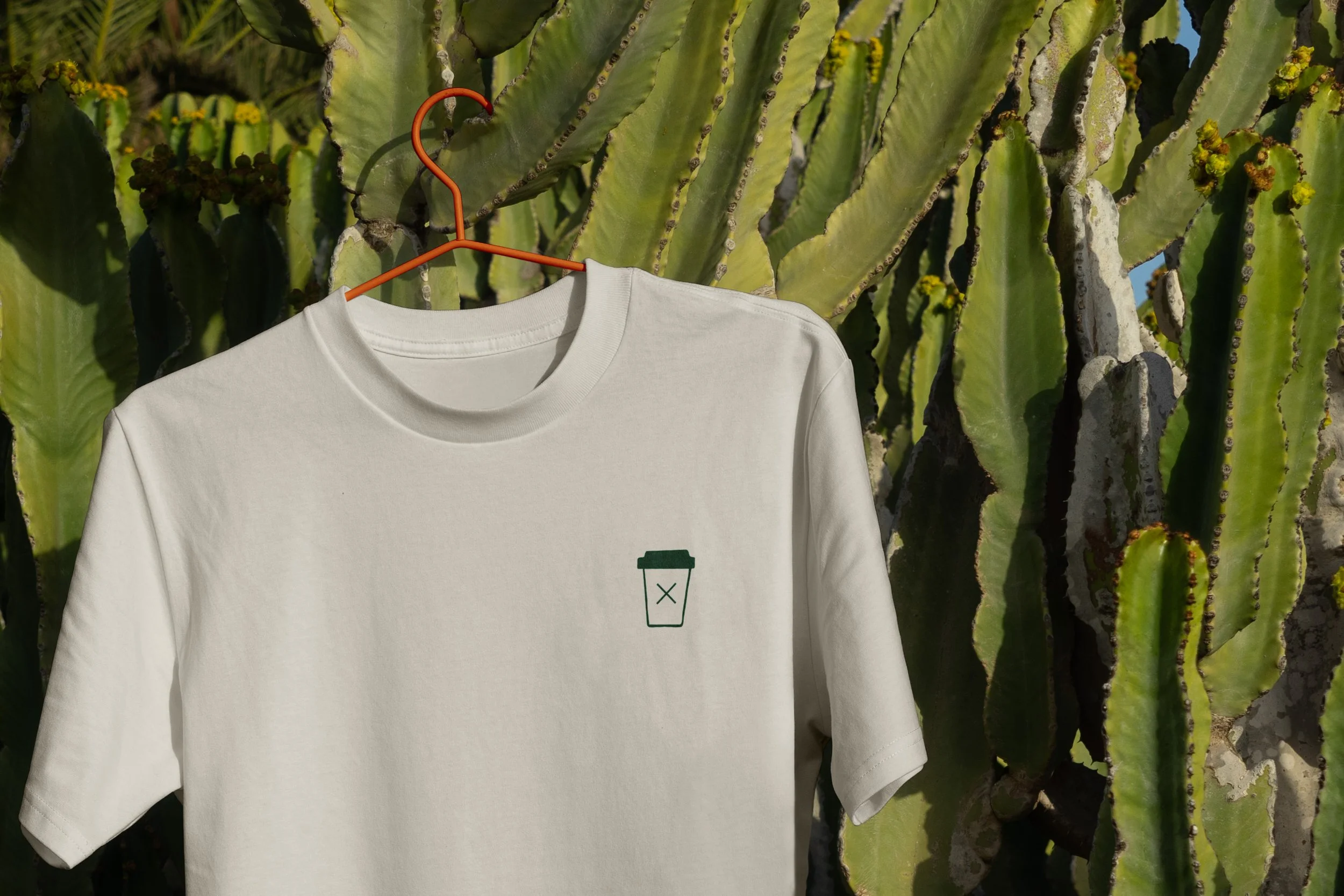
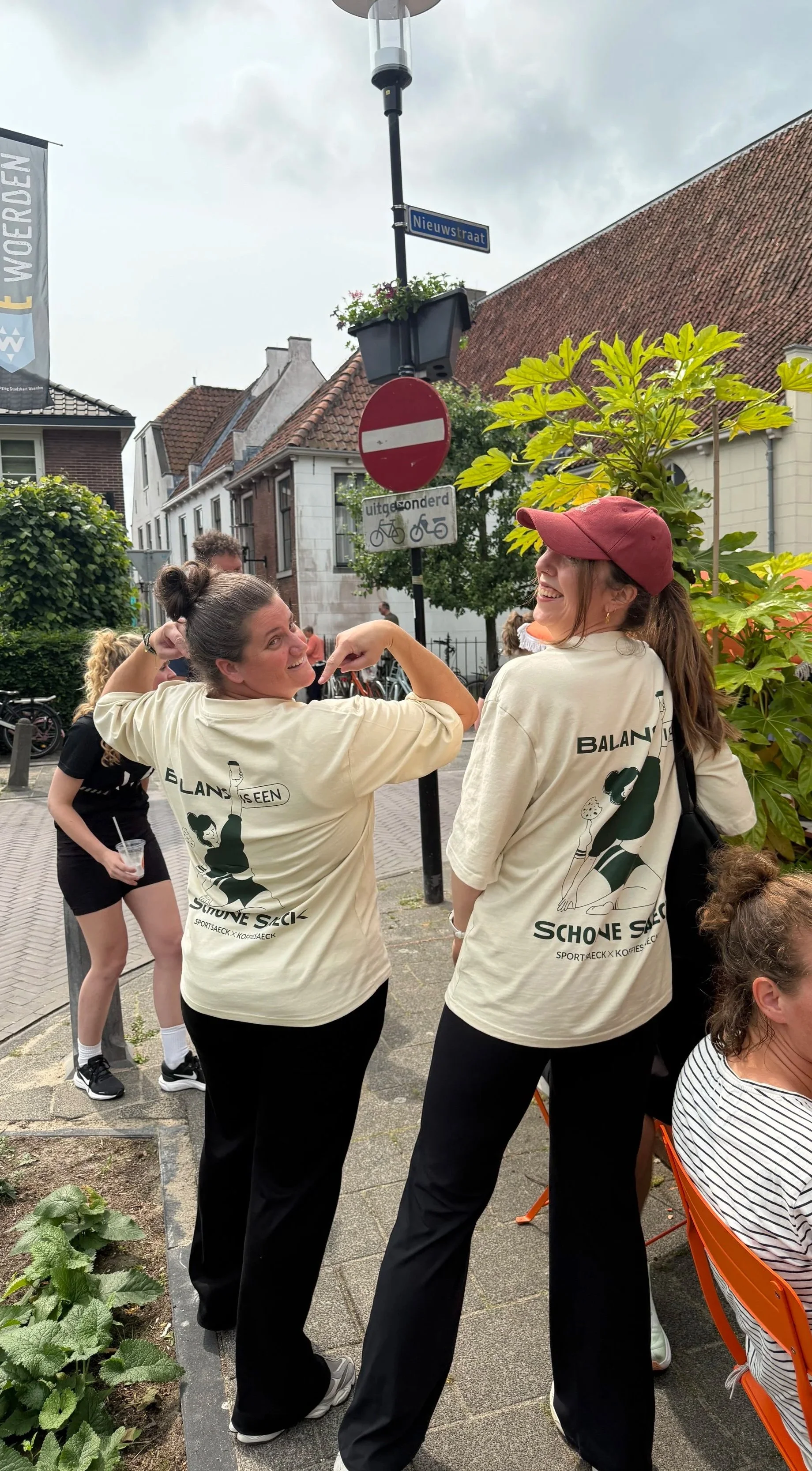
Together with the team from the Koffiesaeck I worked on a limited edition t-shirt, with a custom illustration. We used a twist on an old Dutch saying (‘Geduld is een schone zaak’), ‘Balans is een Schone Saeck’, which roughly translates to ‘Balance is key’, aligning with the philosophy of the business.
-
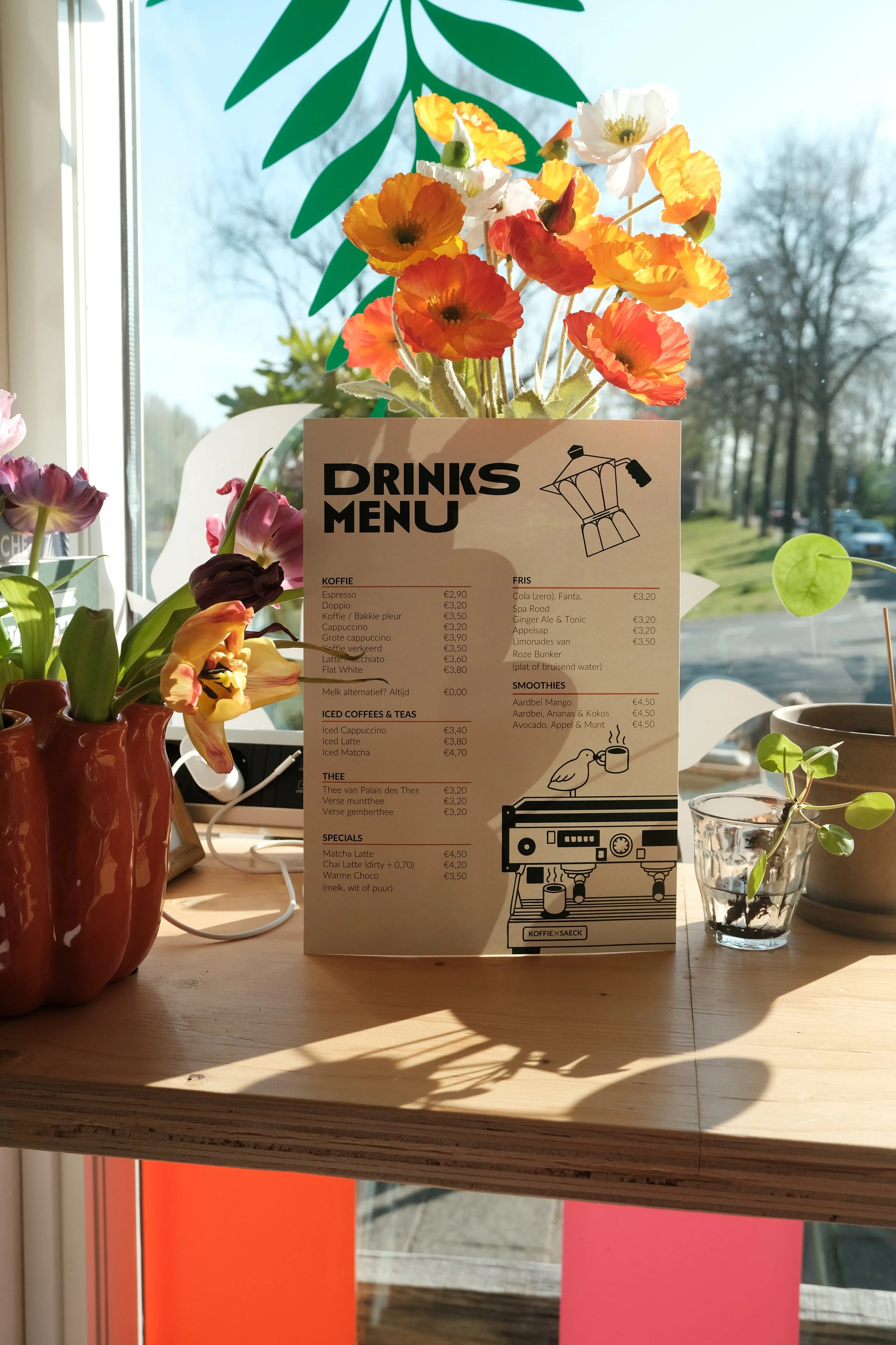
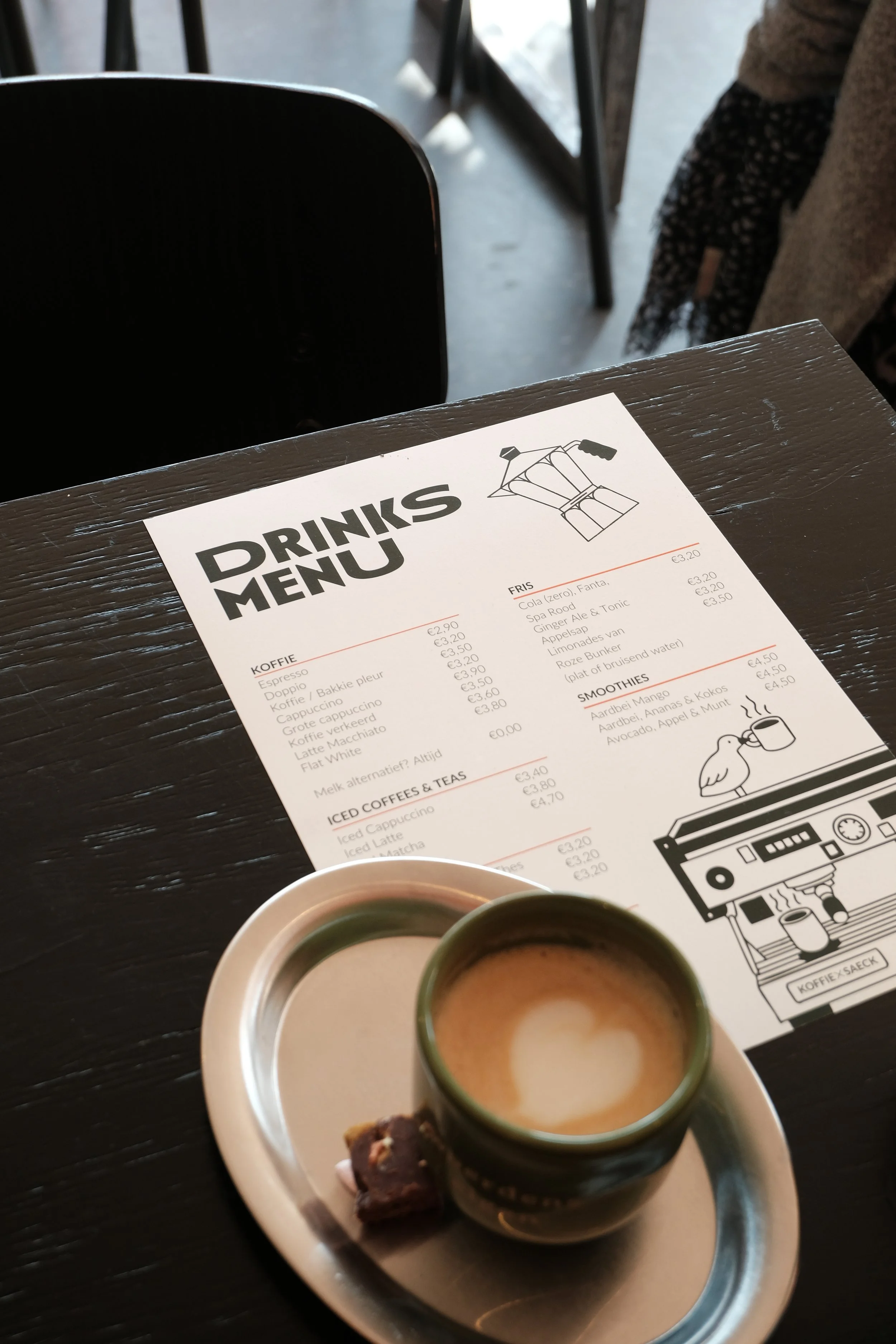
Once we established the brand guidelines, I worked on collateral: menu designs, business cards, loyalty cards, stickers, etc. All with handmade illustrations of course
The scope
The Koffiesaeck has quickly positioned itself as the neighborhood coffee place. They pride themselves in being a welcoming place for everybody, and you can see that back in their menu: they serve everything from great specialty coffees (best flat white in town), to a healthy smoothie. From a protein cookie, to just a proper piece of homemade apple pie. You can meet up for a matcha after your yoga class, or catch up with a cup of tea with your neighbor.
That’s what it’s about for the owners of the business: a balance between tradition and trends, food that is both nourishing and tasty, and a menu that is both modern as well as comforting.
The project goal? Helping the owners build a consistent brand with a more professional look, that they can easily manage themselves. A brand that looks clean and professional, as well as welcoming and open-minded. A visual identity that gives them room to grow, with easy design systems.
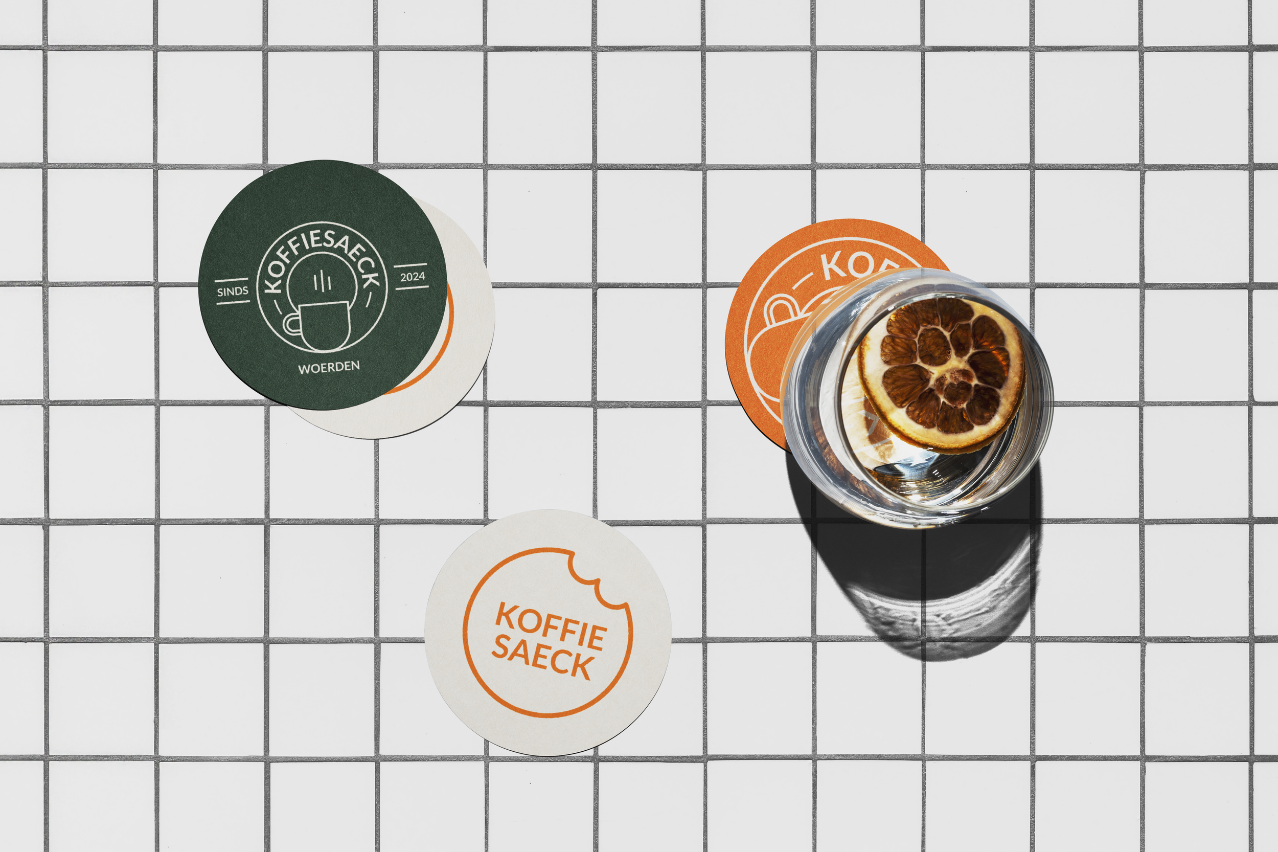
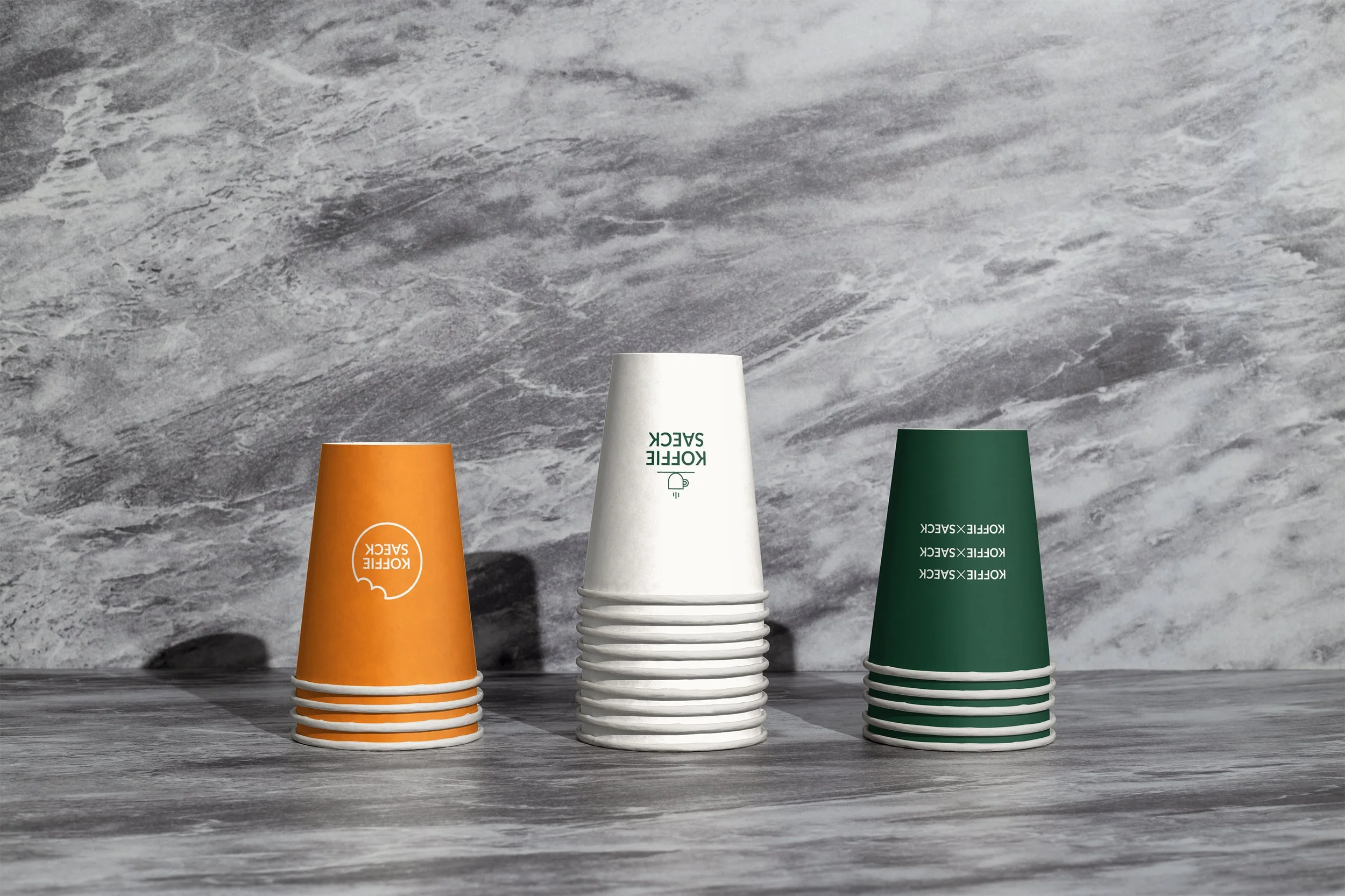
Since the Koffiesaeck had only been in town for a year when starting this brand refresh, we decided to keep the ‘old’ logo: people were just starting to get to know them. I expanded the logo with a full logo kit: giving the team more room to build brand recognition and play around with their logo on signing, packaging & social media.


Menu designs
Merchandise design
Want to know more?
About this project, this client, or my design process?