
Culture Run Woerden
Client: Culture Run Woerden
Scope of work:
-
For this project I’ve worked on a full rebrand: from the logo, to the visual identity to communication strategy and the tone of voice.


The scope
The Culture Run Woerden invites its runners and hikers to go on an adventure in the city of Woerden. You can either walk or run a surprising route through historical buildings, restaurants, art installations, concert venues, museums, and more.
With the team, we decided on the following project goals:
To design a visual identity that presents the event not only as corporate and professional, but as surprising and creative as well. It’s not your average 5K run.
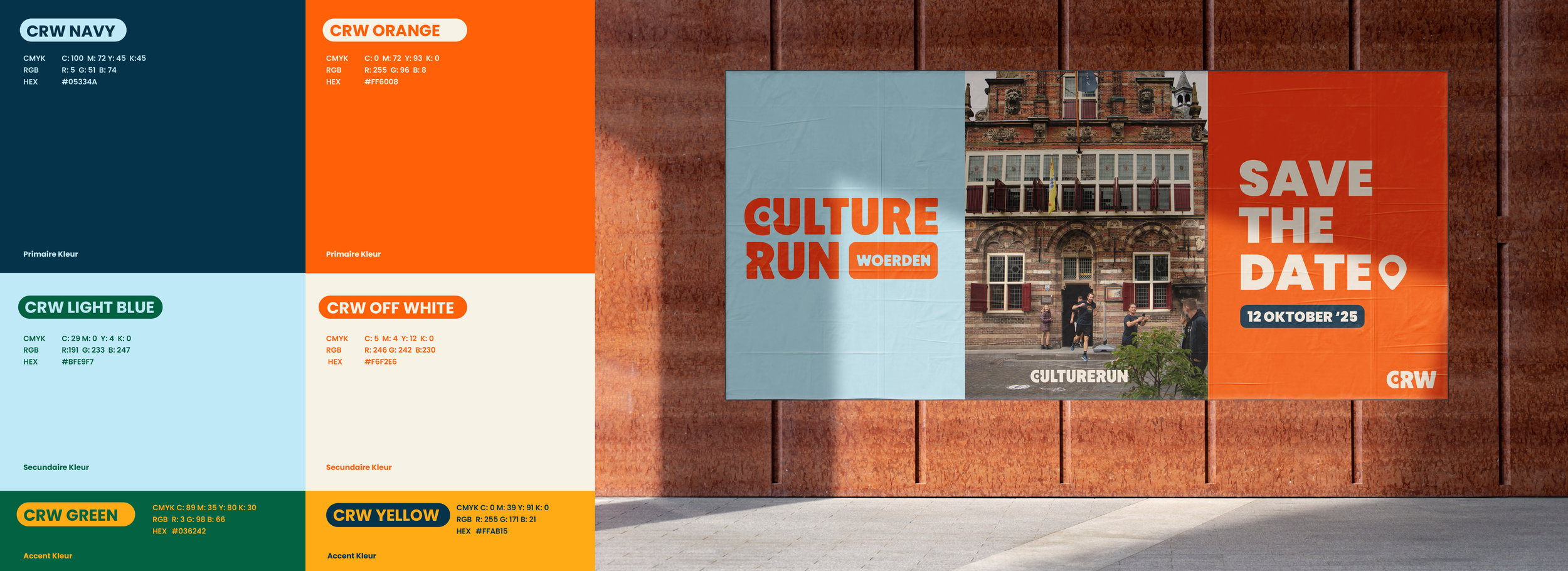
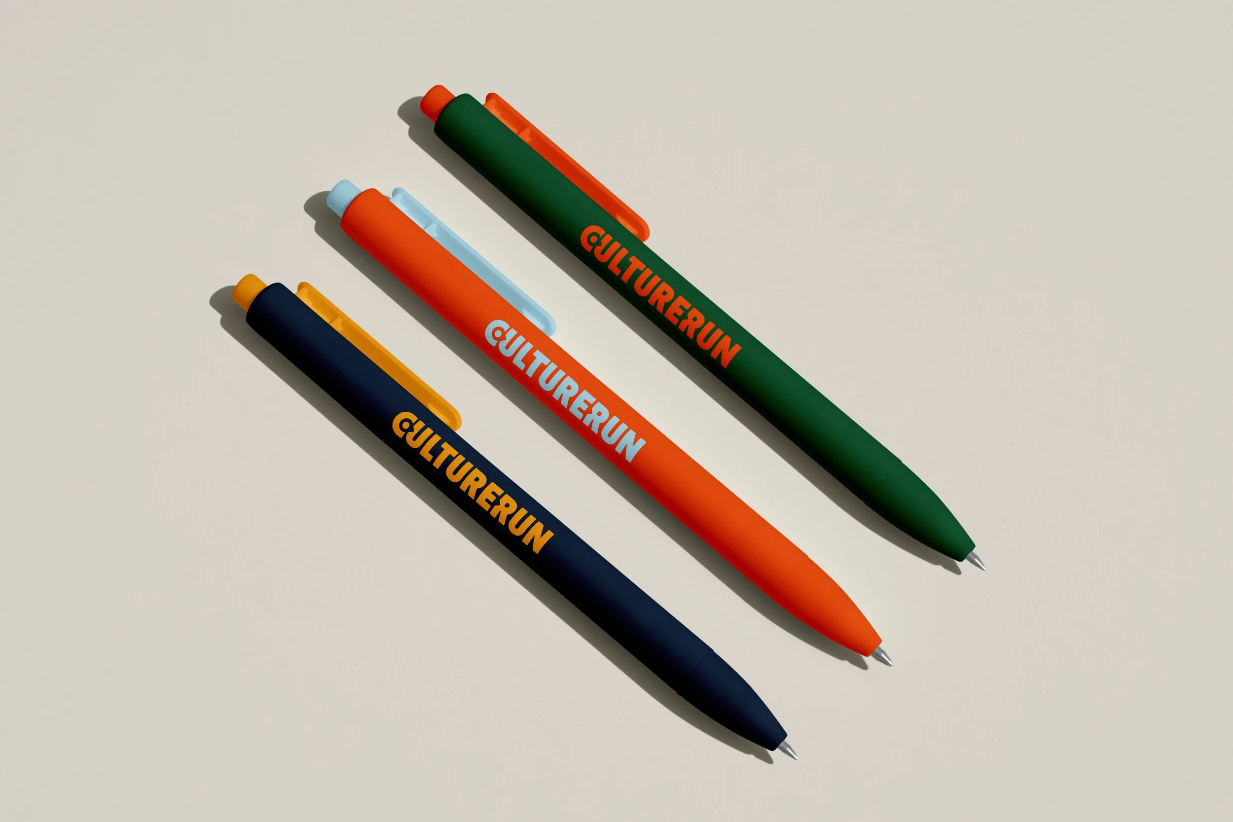
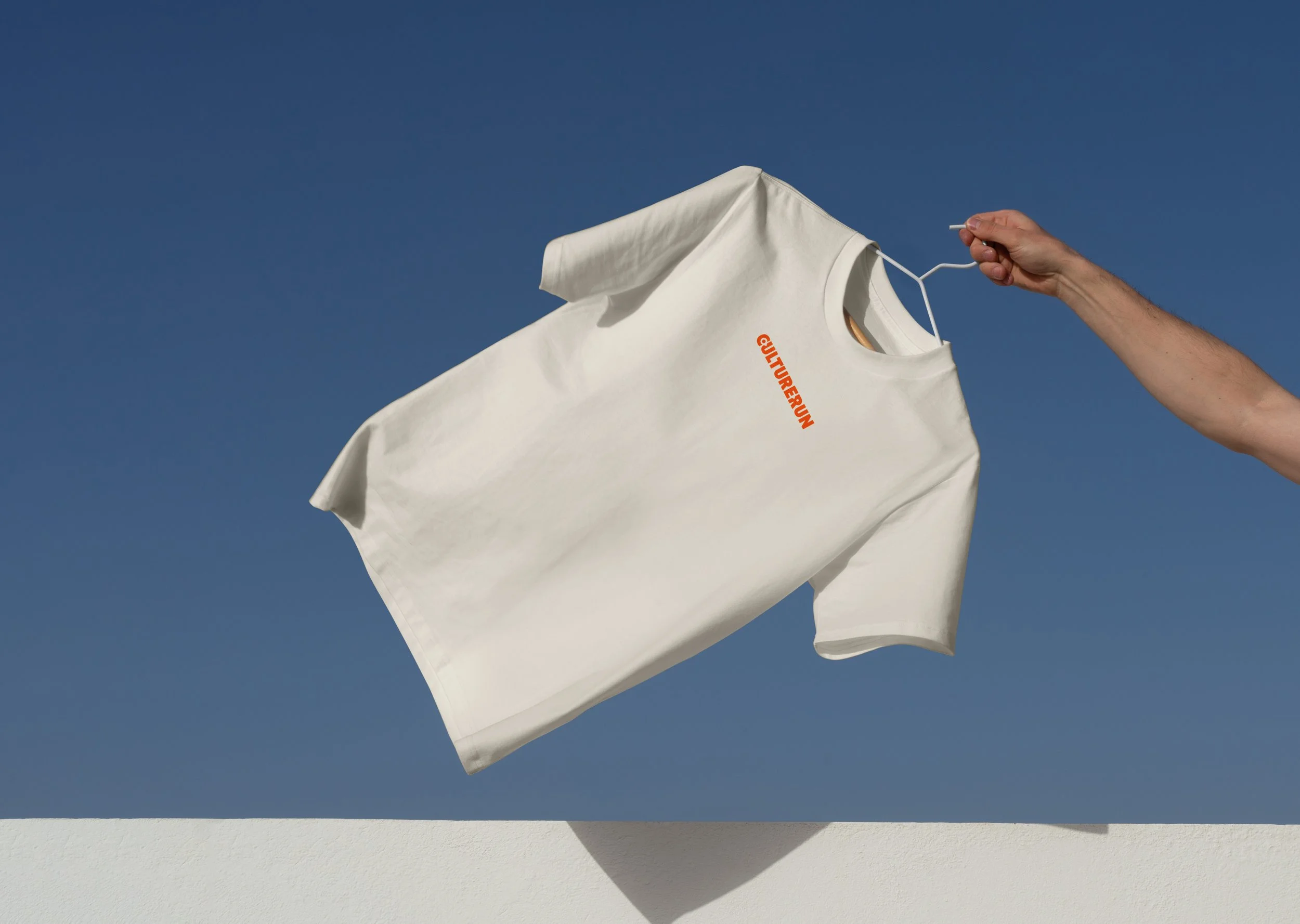
To work on an easy to use design system, with clear examples & templates
To design an easy to use logo kit: making sure the logo is legible in different sizes and on different backgrounds
To keep the event recognizable, even after the rebrand: re-using the main components & colors of the logo ensures the visitors still recognize the event from previous years
Logo refresh
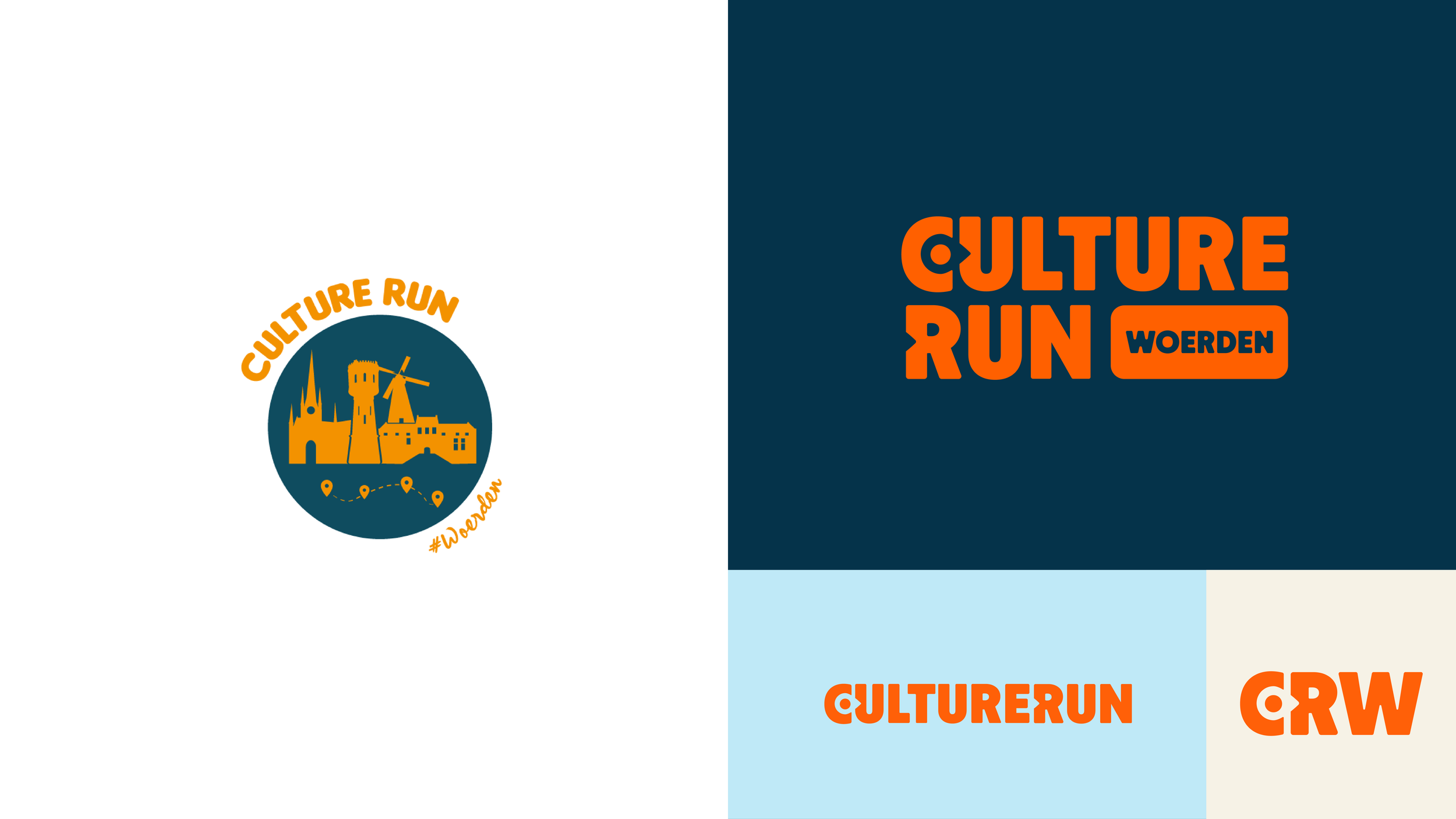
On the left you see the old logo, and on the right the logo kit after the update. The logo consists of a custom typeface combined with the ‘pointer’ of the old logo. The typography is still looks rounded and fun, just as the ‘old’ logo, but it’s more modern and easier to use.
Want to know more?
About this project, this client, or my design process?