
De Inspirerende 40 rebrand
Client: Synergie
Scope of work:
-
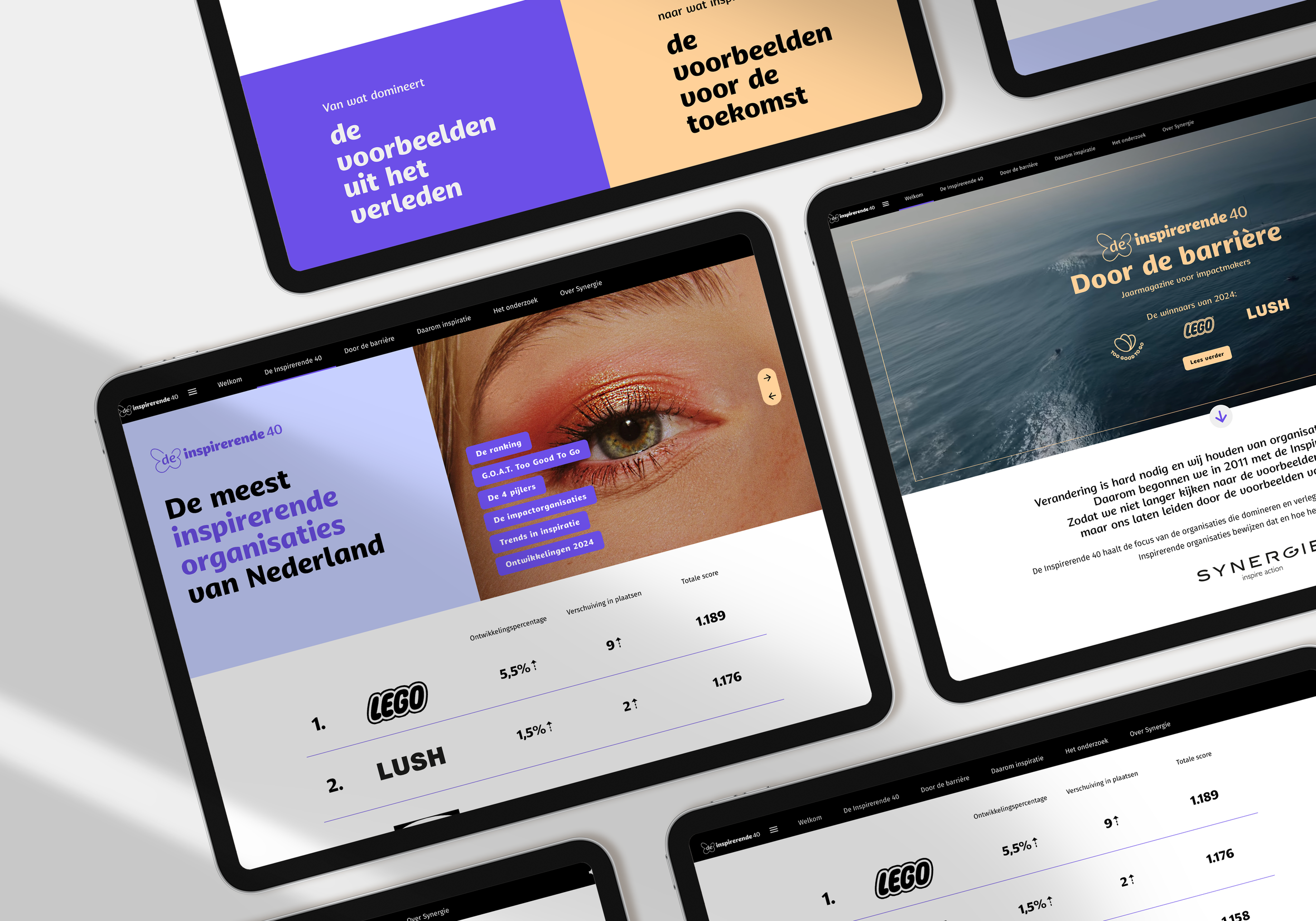
A full rebrand of the visual identity of de Inspirerende 40. Including: a new colour palette, a logo refresh, a logo kit, new brand guidelines, templates for the online magazine & art direction for the online magazine
-
Designing different media for de Inspirerende 40, such as: templates for the online magazine, presentation templates & social templates

The scope
De Inspirerende 40 is a yearly study on what the most inspiring organizations are, according to consumers in the Netherlands. The team behind this strives to put a spotlight on different companies & organizations than the market leaders dominating traditional media. They aim to switch the narrative from examples from the past, to inspiring examples for the future.
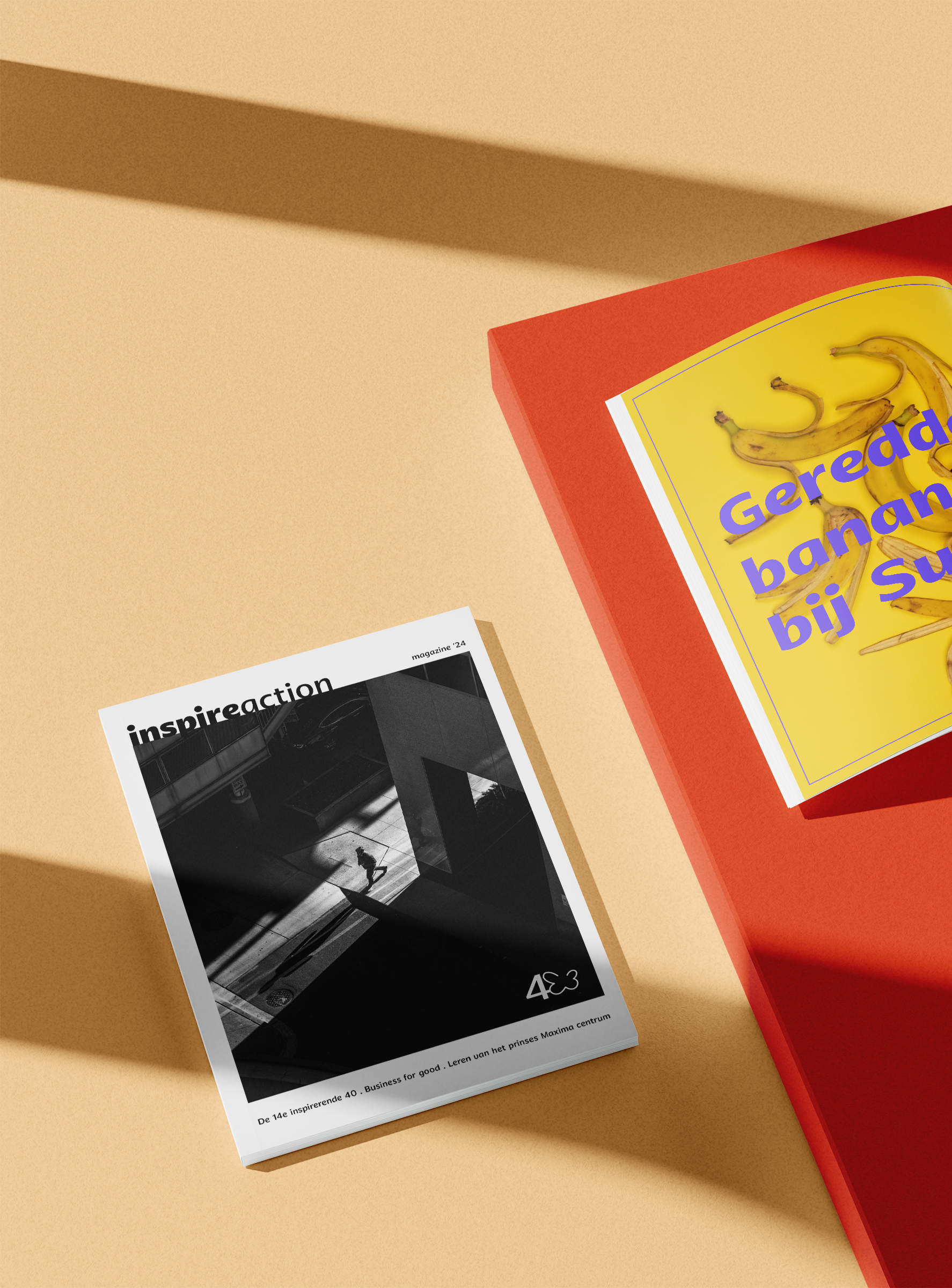
Every year the team worked on their publication ‘Inspire Action’ in different publication platforms, without sticking to one certain visual style or identity. Together with the switch to a new digital platform for the magazine for the next few years, the team contacted me to work on a more cohesive style.
The most important challenges were:
Keeping the brand recognition: De Inspirerende 40 had been around since 2011, and had built connections with many organizations with that name and logo.
Keeping flexibility: every year the team loves to highlight different equally inspiring images for the magazine. Sometimes these images are from renowned artists, sometimes from inspiring events and companies, and sometimes AI generated images. The visual identity should be able to work alongside all of these different kinds of images.

To keep the logo recognizable, I chose to update it with a few tweaks:
A new typeface as a base, that fits the creative and modern character of De Inspirerende 40, without being too ‘trendy’
I tweaked the placement of the text slightly: in the original logo the text isn’t completely legible because of the icon running through it, which is especially a problem when scaling the logo down. This way, the logo is more legible, and can still be read nicely when scaled down.
I simplified the butterfly icon slightly: still recognizable, but easier to use
I worked on a logo kit to make sure there is more flexibility in the designs for different media.


Logo before the rebrand
Logo after the rebrand
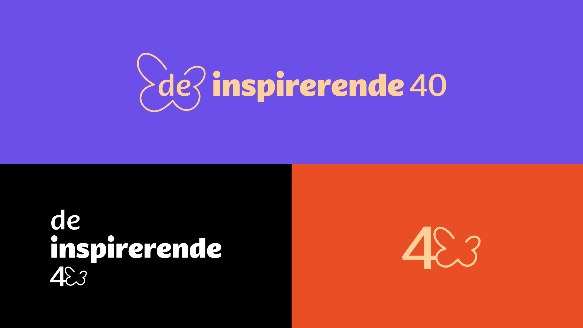
De logo kit
The magazine is built in Foleon, a platform for interactive online magazines. By designing the base ‘blocks’ of this magazine, the team could fill in the different articles & data easily, for years to come.


Want to know more?
About this project, this client, or my design process?