
Client: Impact on the Beach
Project: Impact on the Beach 2025
Scope of work:
-
For this project I’ve worked on a full rebrand: not only on a visual level but on a strategic level as well. We took a close look at the target audience, positioning, and tone of voice, as well as the visual elements (including an updated logo)
-
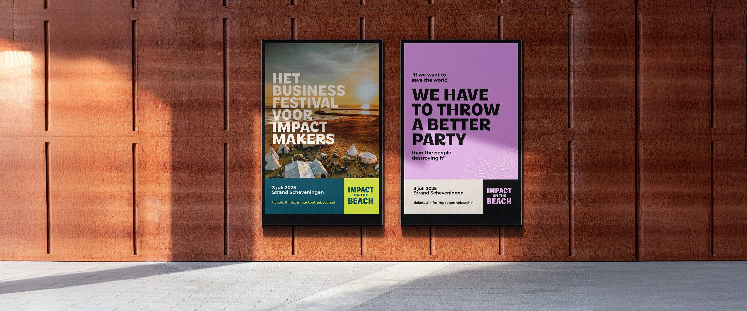
Aside from the brand identity (which should be the foundation of the event for the following years) we also worked on a specific campaign for the 2025 event, based on the theme of this years festival. The campaign includes custom illustrations and an additional colour palette.
-
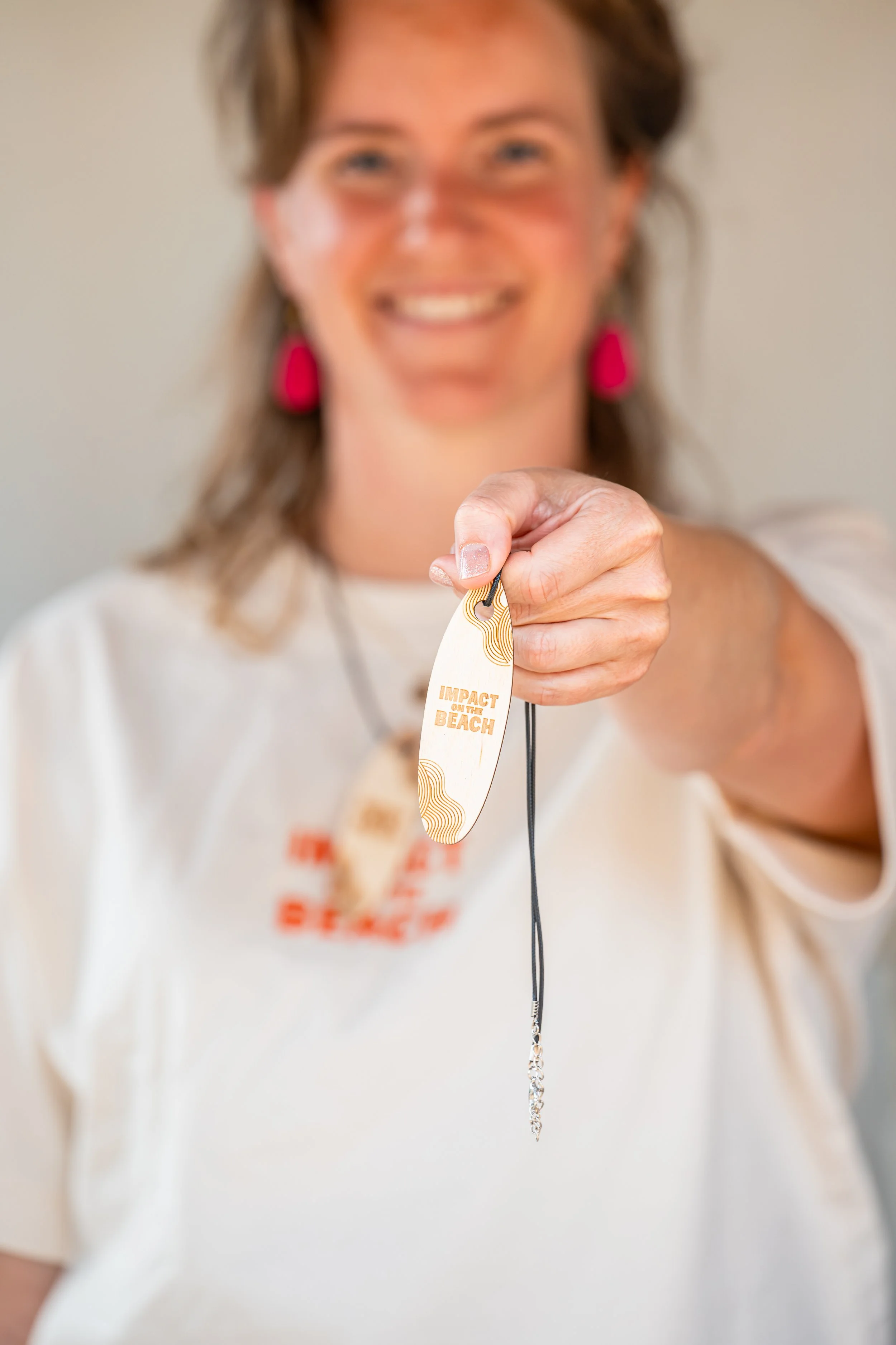
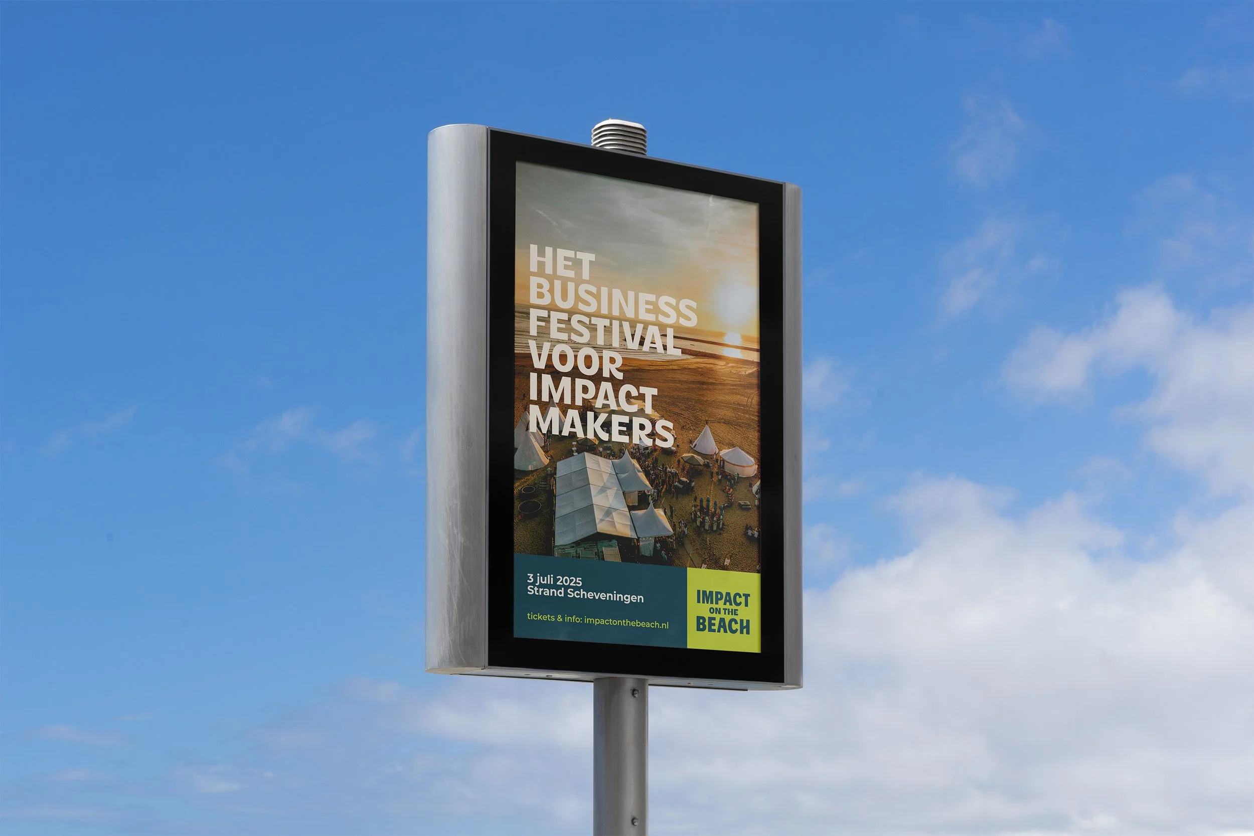
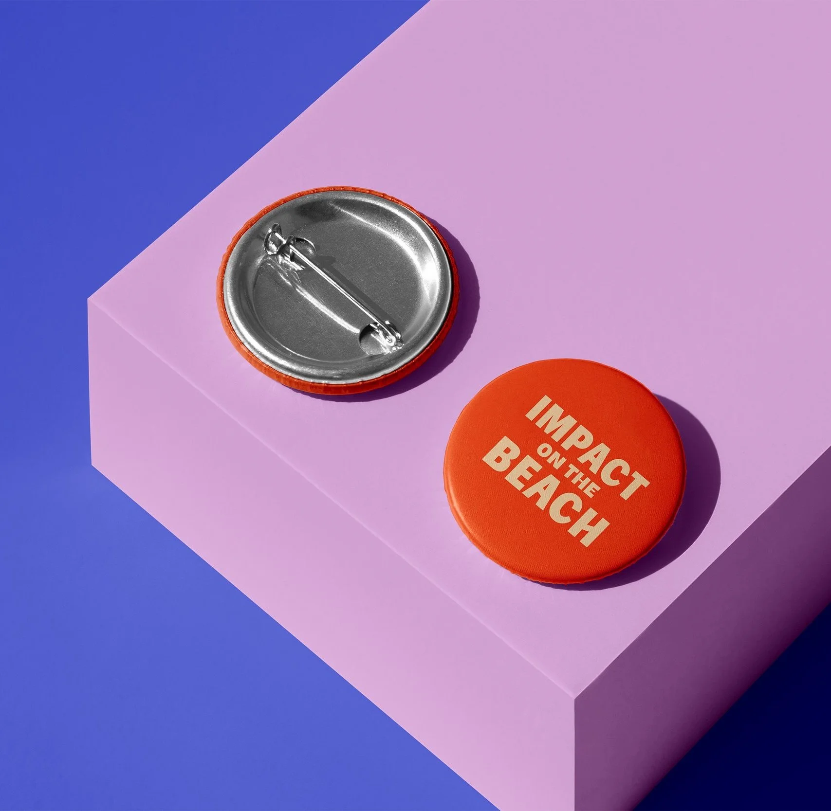
I worked on collateral for the event, including: the website, timetable, festival map, Linkedin posts, print advertisements, signing, crew shirts, name tags & presentation templates.
The scope
Impact on the Beach is the business festival for everyone who wants to make real impact. Bringing the event to an inspiring venue, beachclub The Shore in Scheveningen, helps professionals get out of their usual work environment and into a more inspiring and creative setting. The combination of the venue, small scale sessions & creative side programming makes this a unique event, focused on real connection and inspiration.
Together with the team we concluded the following goals:
Making sure the visual identity not only looks corporate and professional, but inspiring, innovative & progressive as well
Making sure the visual identity is easy to work with, with clear templates & guidelines
Keeping sustainability in mind, it does not make sense to completely redo the logo: since the logo has been printed on a lot of material already, we can only redesign it in a subtle way, so that we can still use the old material alongside it

Logo Refresh
On the left you see the old logo, and on the right the logo after the brand refresh. The logo has been simplified, updated with custom typography, and expanded to a logo kit so that you can use the logo on different scales and backgrounds. When you look from a distance, it still looks like the same recognizable logo, but when you look up close you can see it’s simplified to a more modern and legible look. That way at the festival, the team can still use both the old and the new logo next to each other, without it clashing too much.


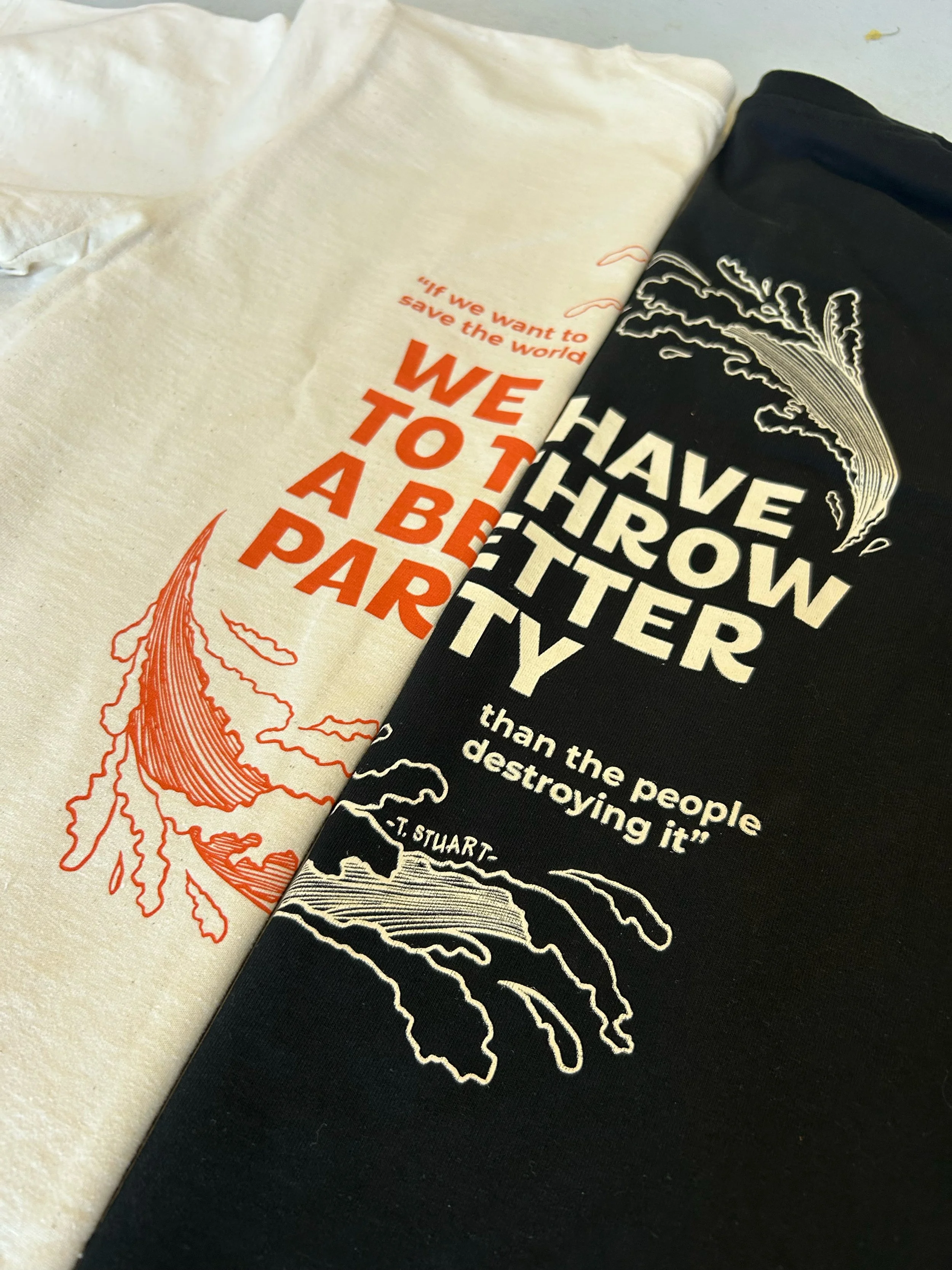
Partner & Crew T-shirts

Designs with custom illustrations, for the different themes in this years program
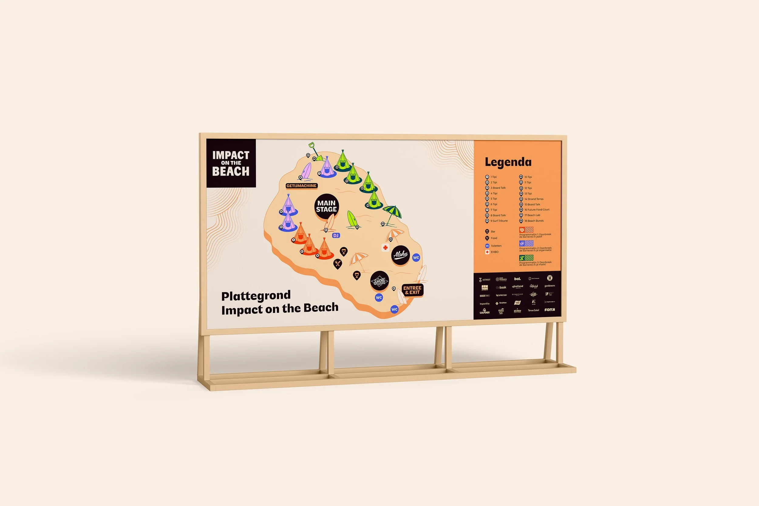
The festival map

Want to know more?
About this client, this project, or the design process?